American Heart Association Identity

American Heart Association
When we first started working with The American Heart Association, they had an ambitious goal to reduce heart attack and stroke in the world by 20% by the year 2020. The ambitiousness of that goal is exactly what inspired our team the most. That same ambitiousness also required us to rethink their entire organization. I should also mention that that is a very difficult thing to do for an organization that has been in the heart business for nearly 100 years. We wanted to push Heart onto the same stage as Fitbit, Nike, Peloton, and other brands that encouraged movement. We needed to be modern, and relevant (since we all have hearts) to a very large audience. We also had to take it personal, since we all know someone that has been or is affected by some form of heart health.
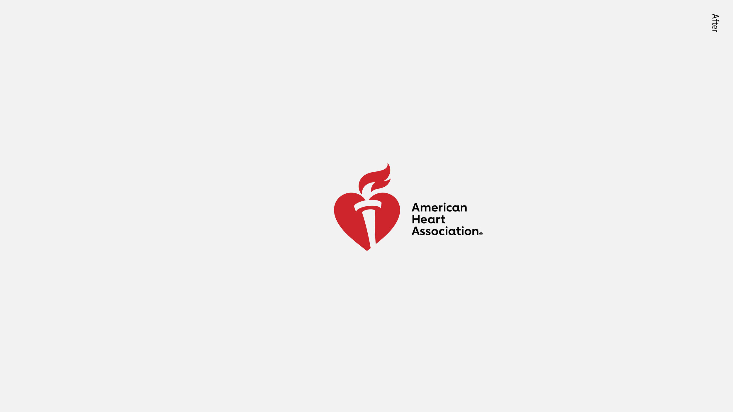
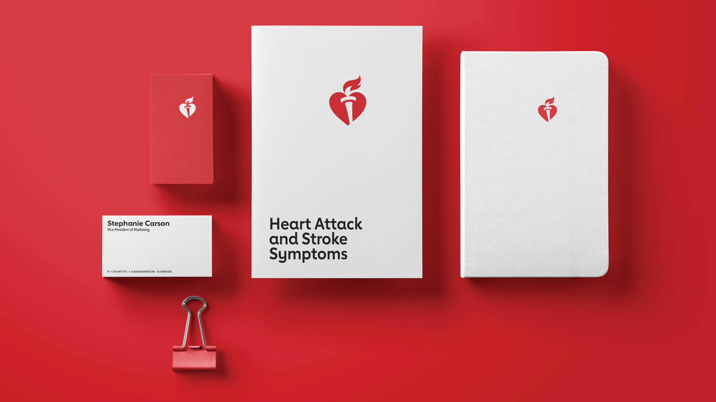
Logo Refresh
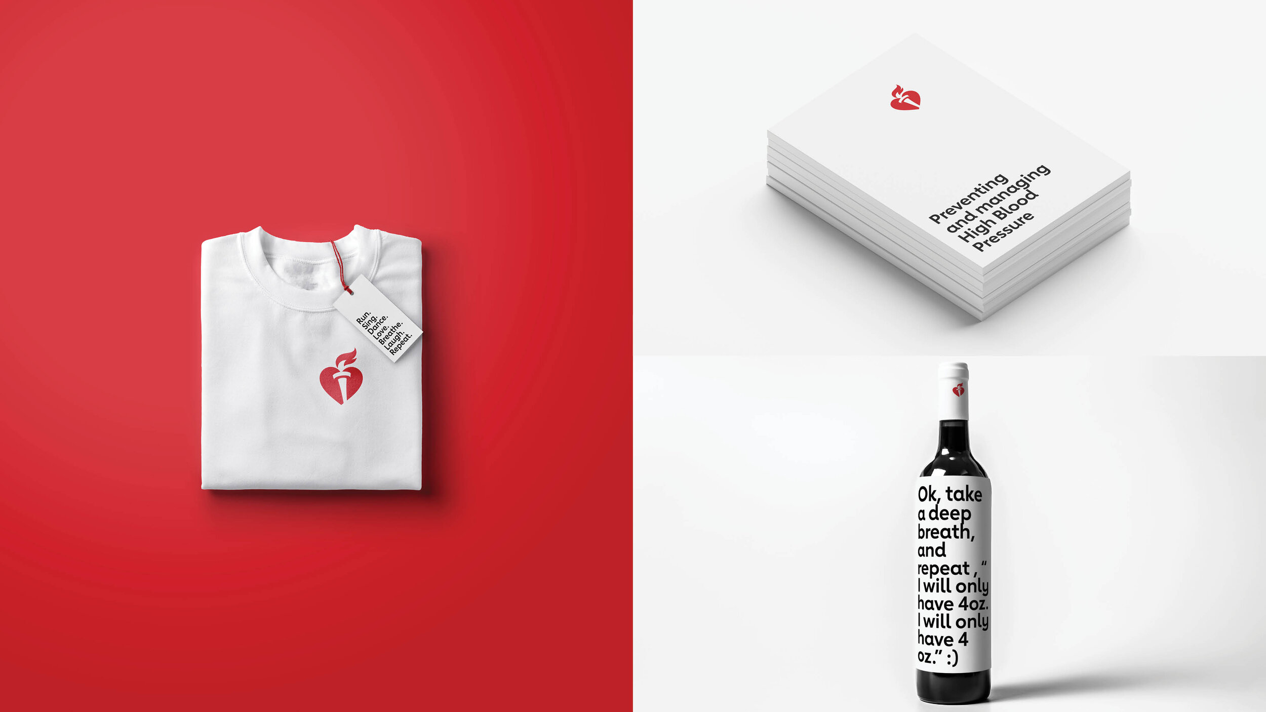
One big problem this client faced was that they are an organization that has many, many smaller organizations within. Each smaller organization used the logo differently depending on their needs. That often resulted in size variations, color variations, or even messaging that was tacked on to the logo itself. The logo was very crowded and cumbersome, and we needed to design a system that could work for everyone. It needed to be simplified and also new.
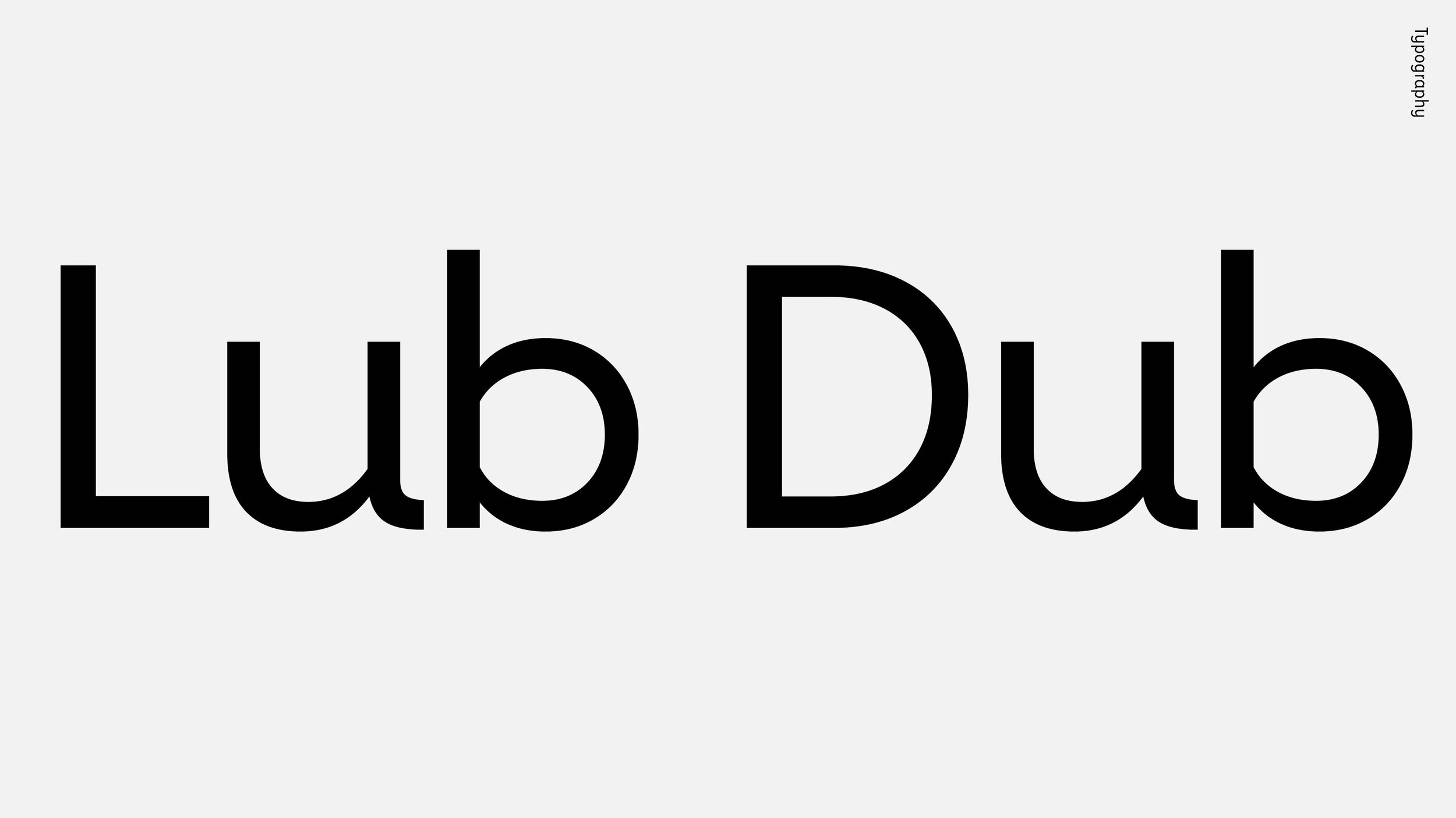
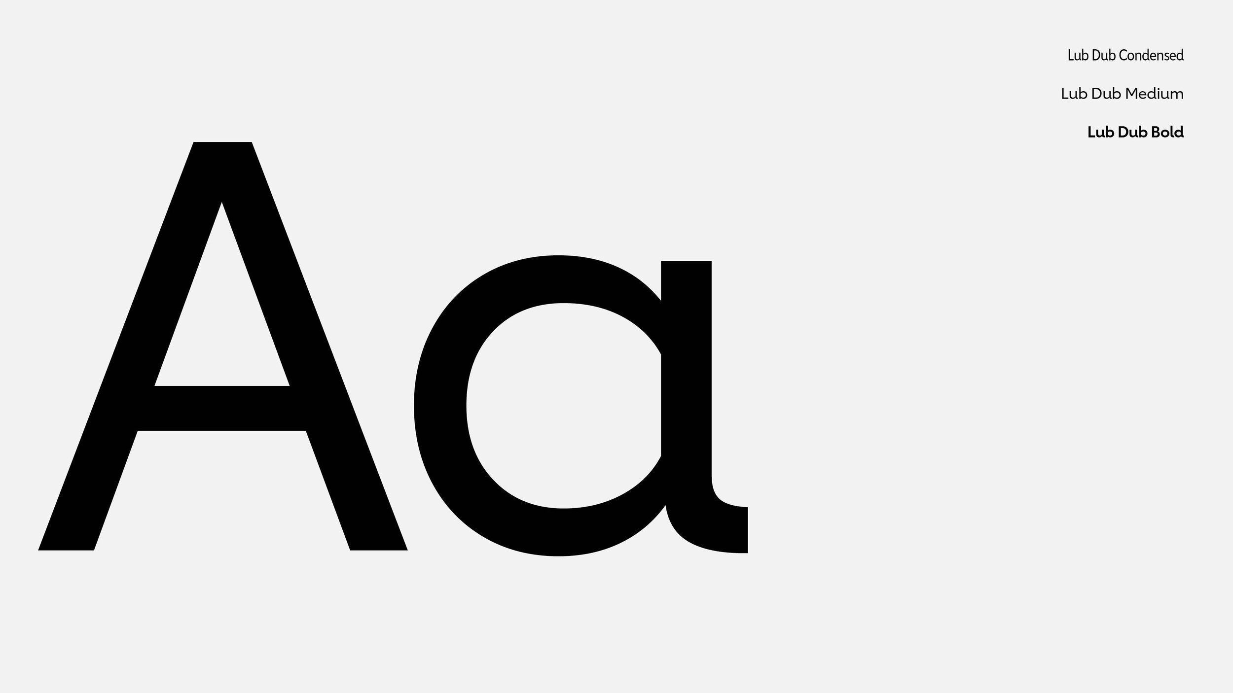
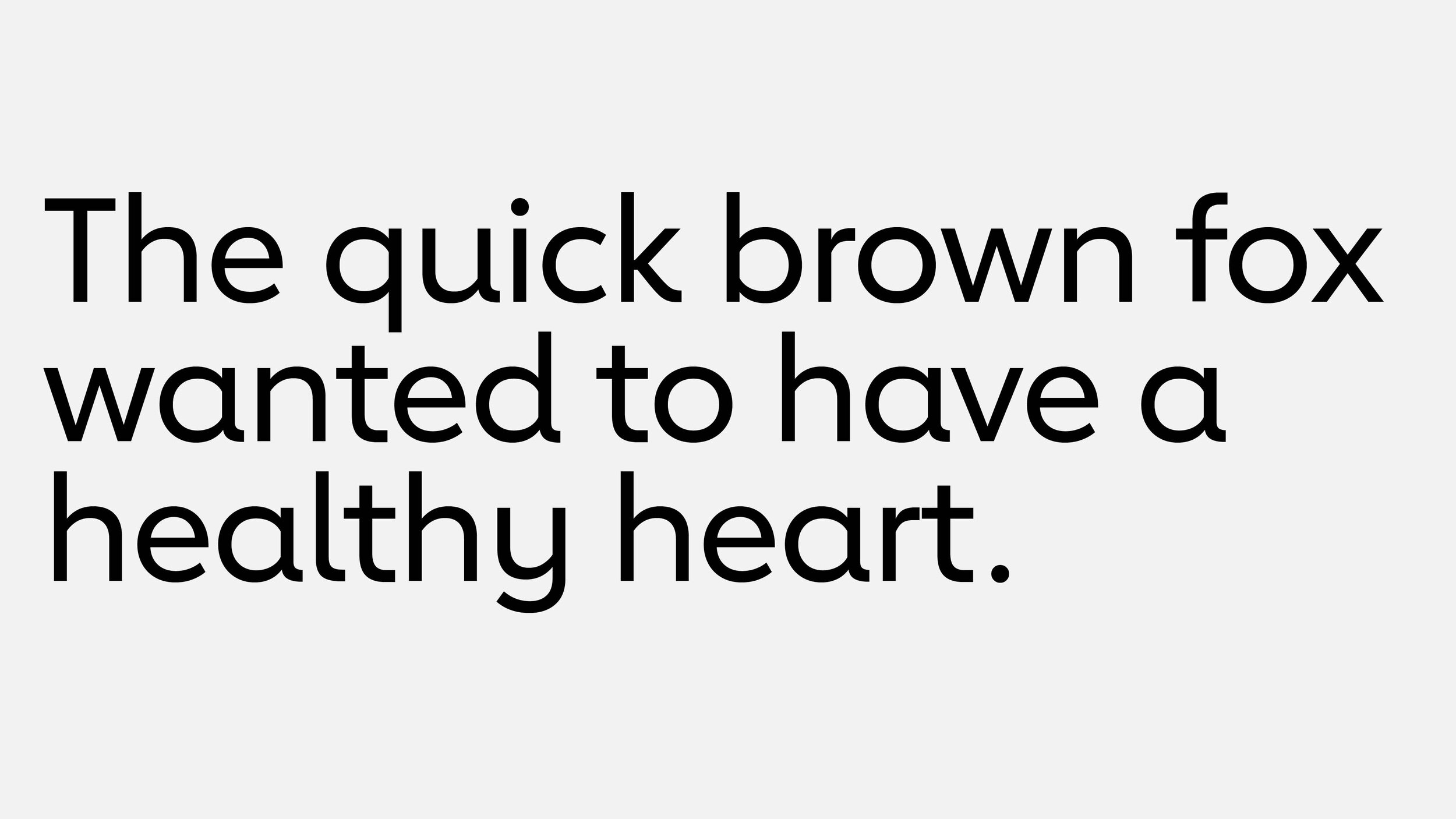
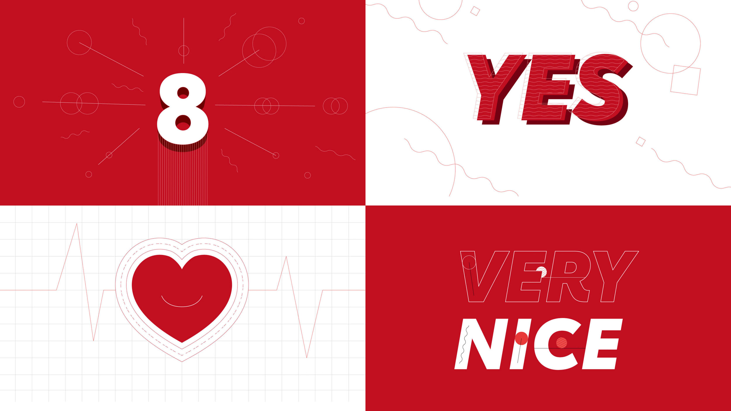
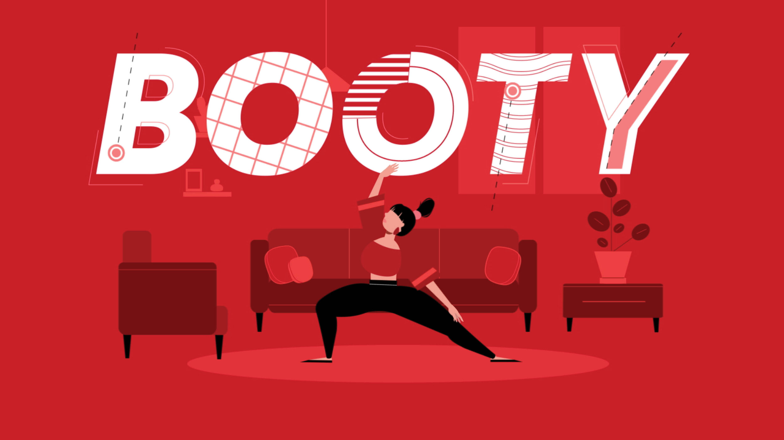
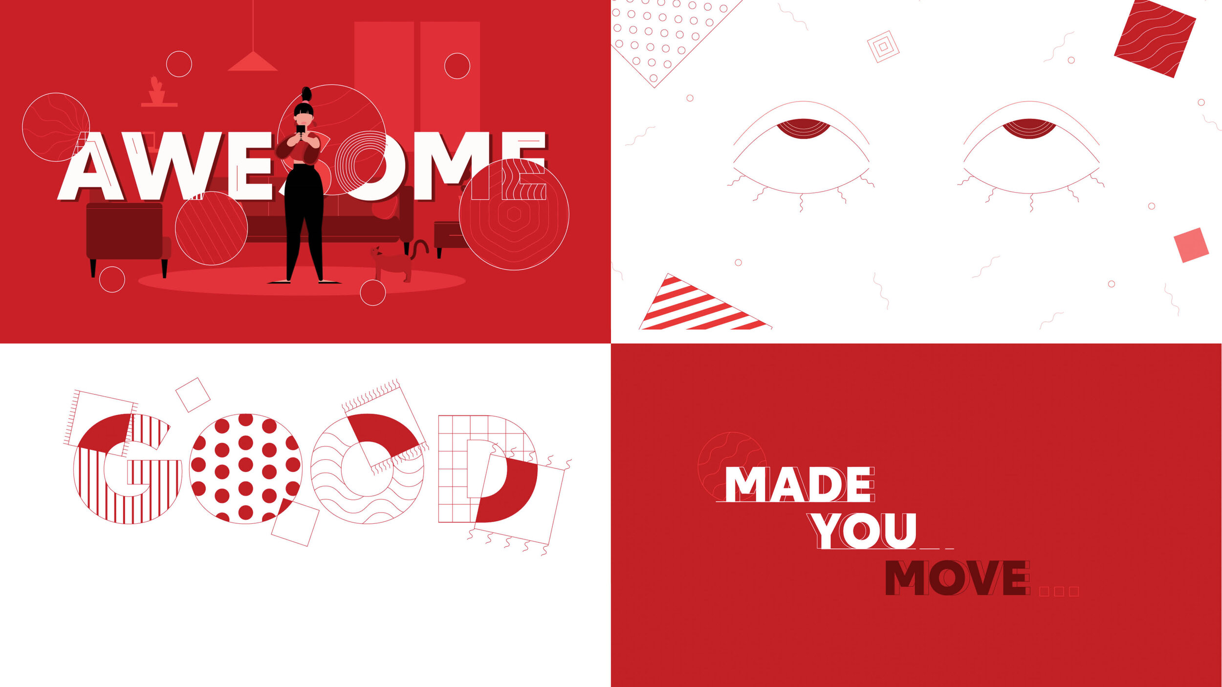
Typography
We developed a custom font that would not only work for their internal needs, but give them a bit up an uplifting identity. We wanted something that felt friendly.

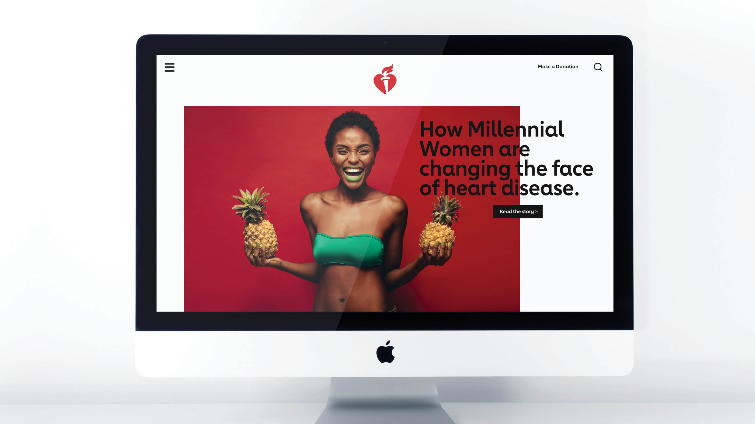
The world of Heart
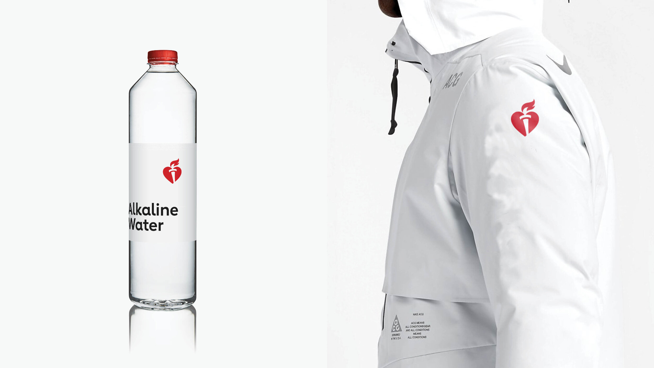
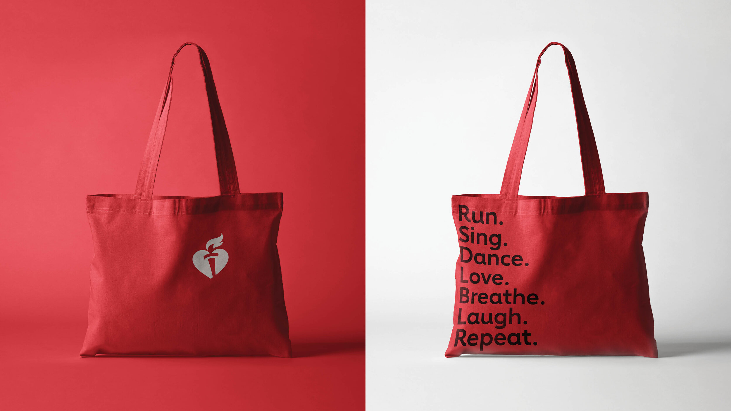
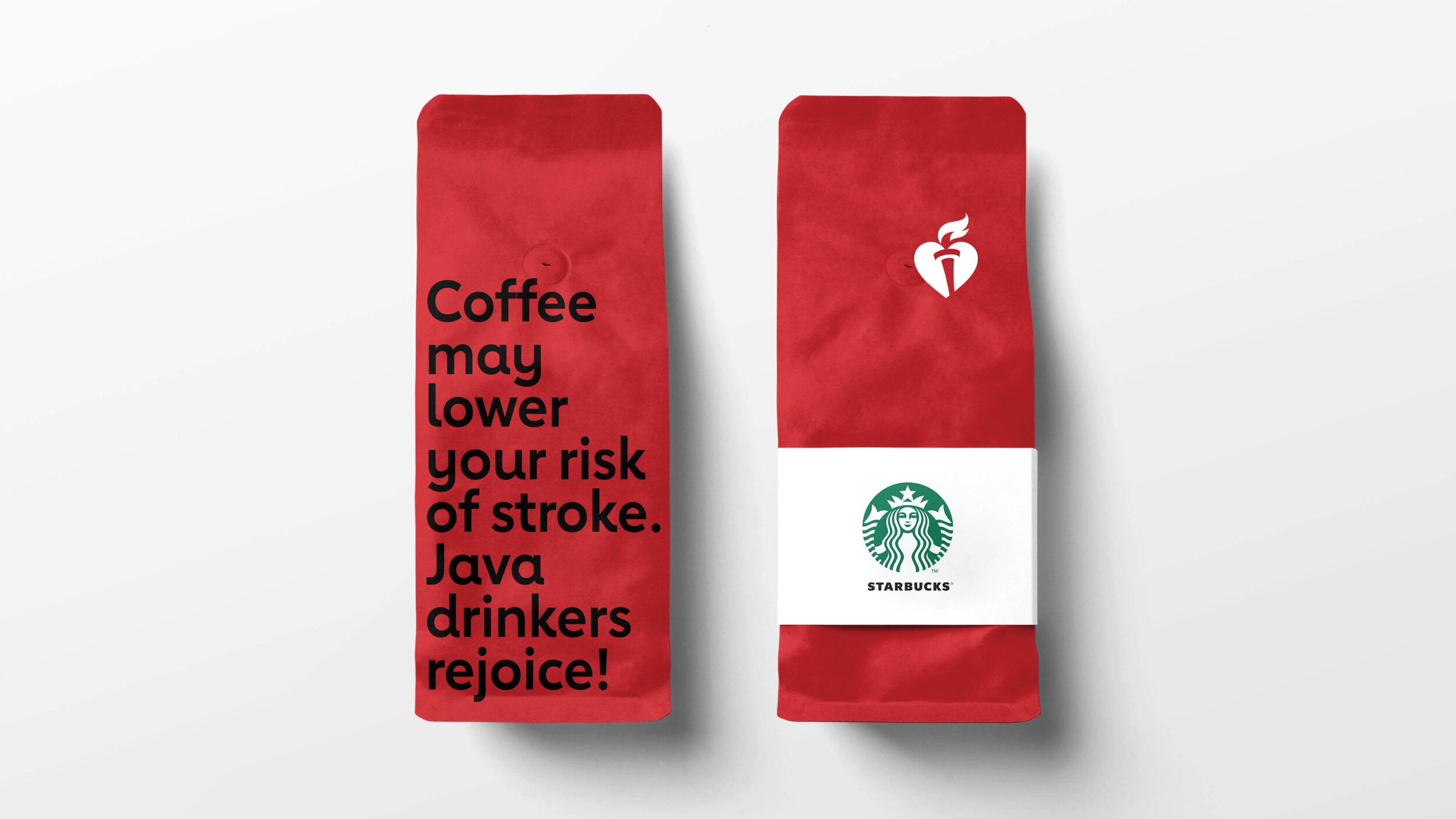
One thing we loved about this organization (aside from all the heart healthy stuff) is that they do a lot of events, and they have a lot of great partners. We developed a design system that would show them how to talk to their audience in unexpected places, as well as how to behave. We looked for little things they could do to bring heart health into the conversation with their partners.
Photographic/Illustration style
Non-profits can be an atypical type of client with atypical production budgets. We had to be crafty with how we maintained their identity. We developed a photographic toolkit for them that was entirely stock imagery. Overall, we wanted an energetic, diverse, and beautiful suite of assets that felt fresh and modern.
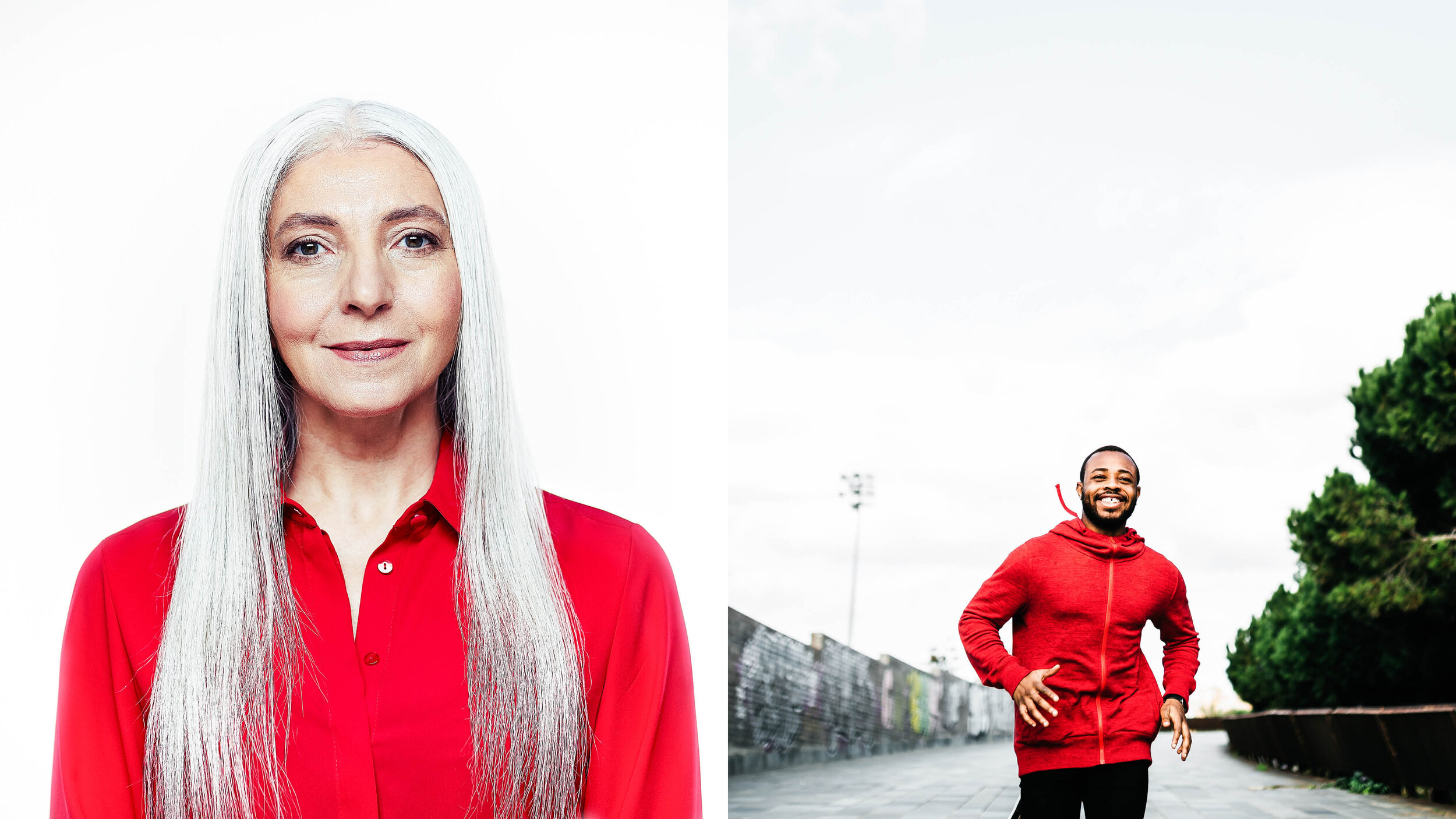

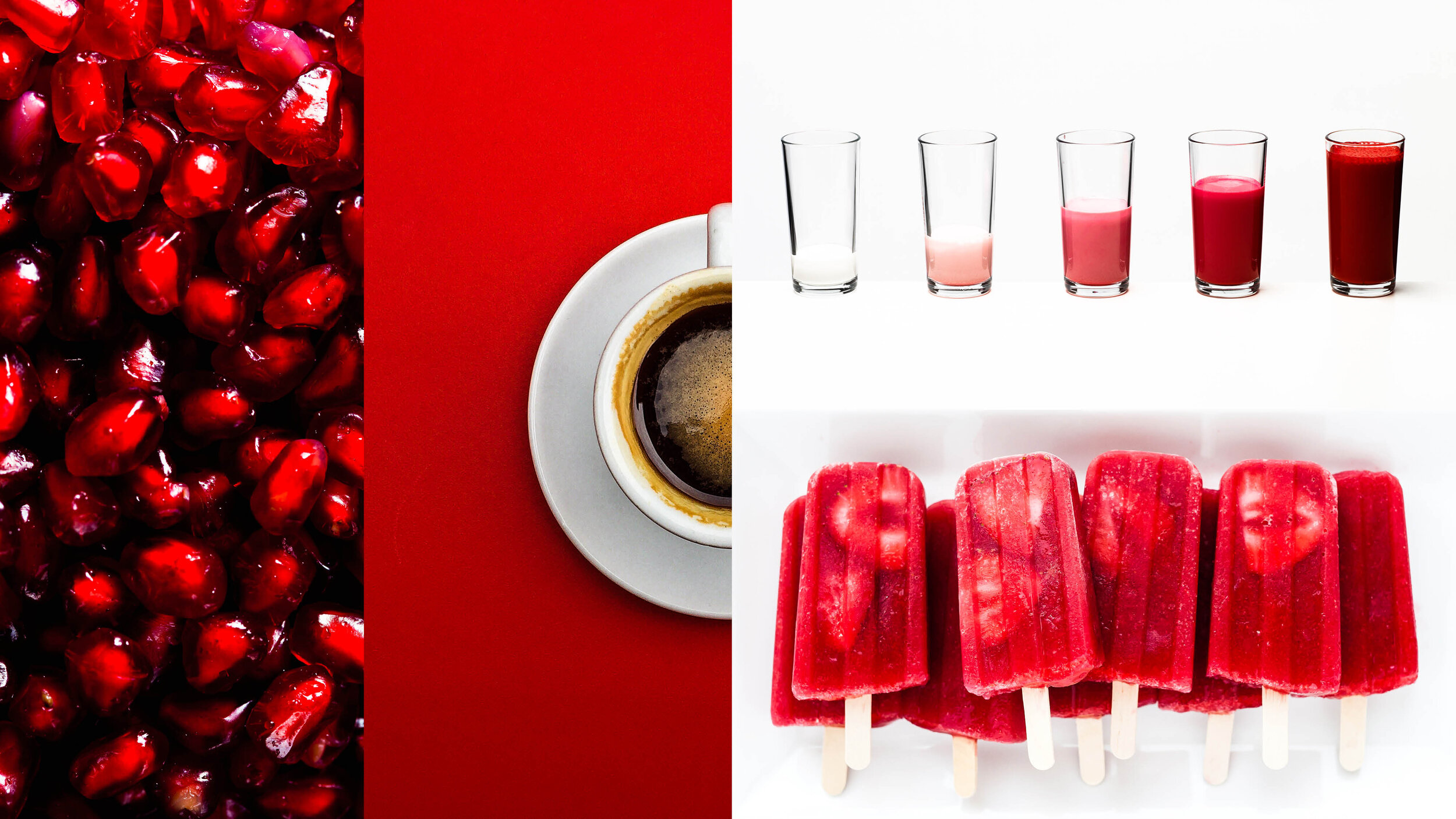
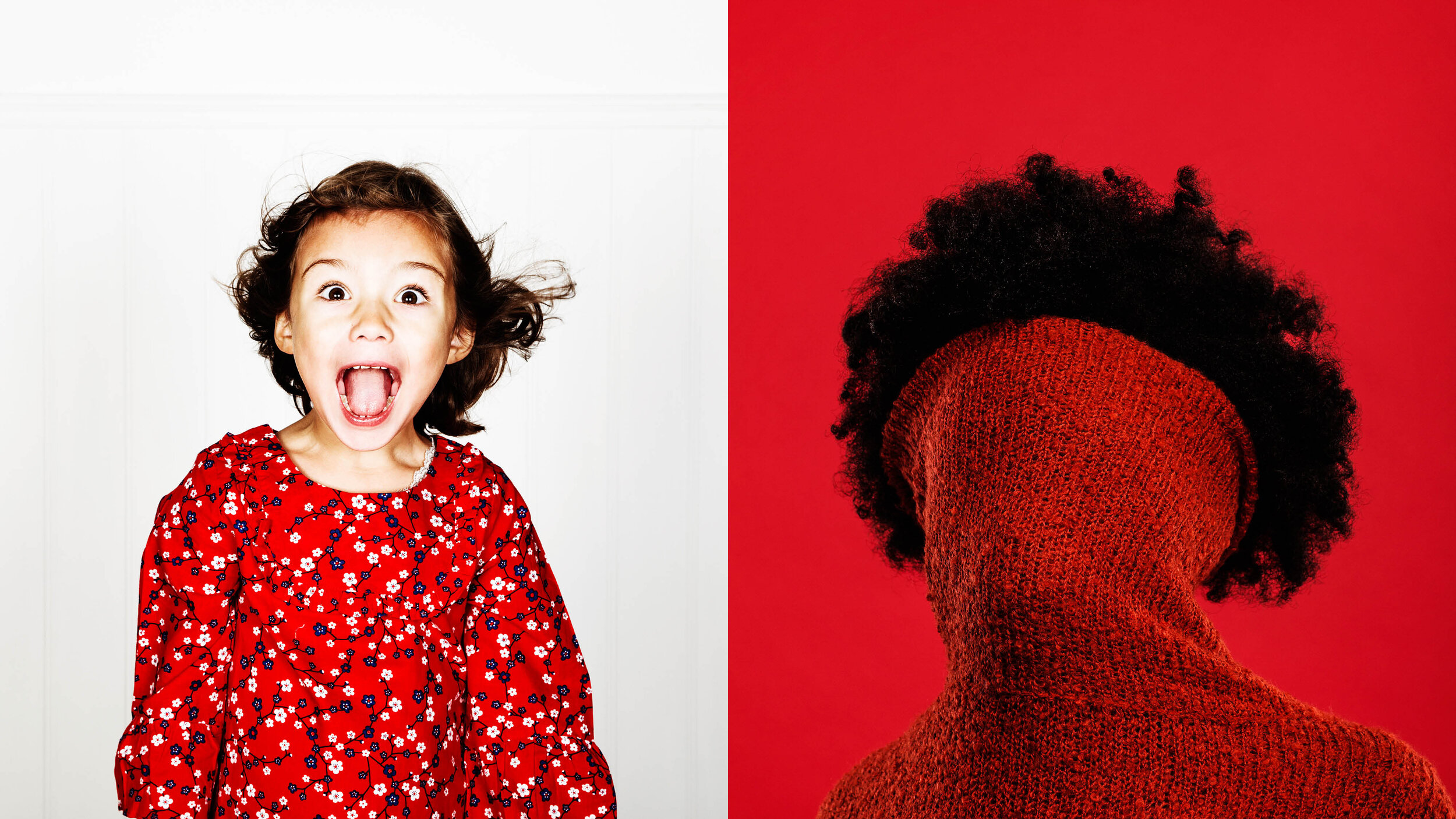
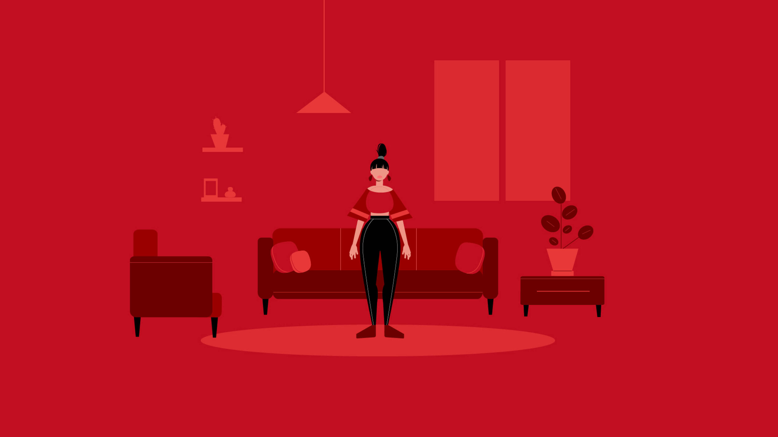
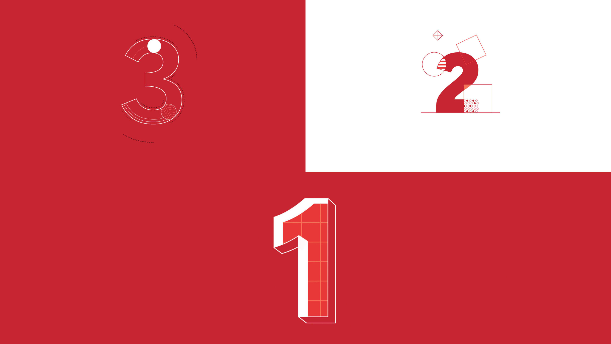
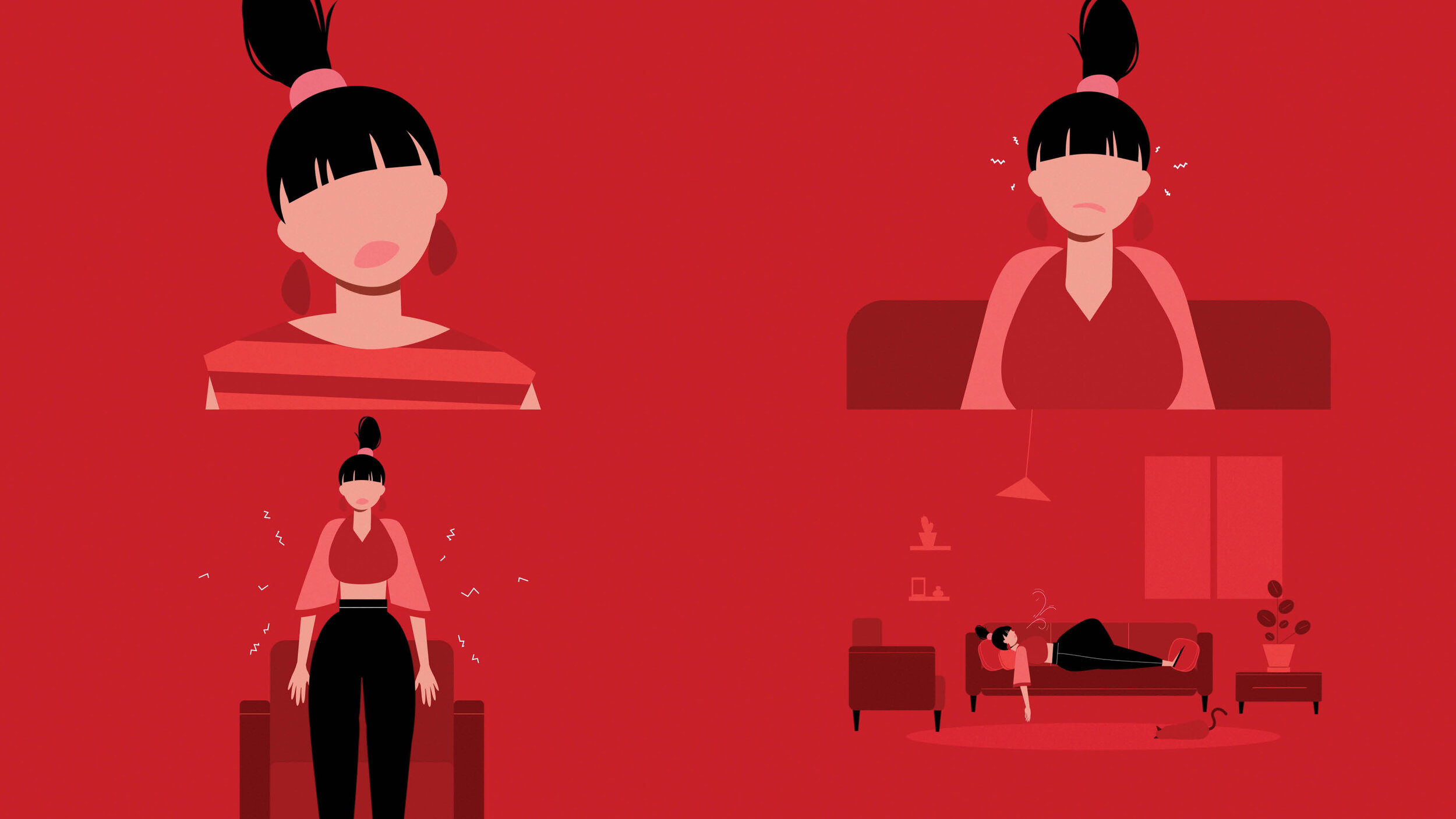
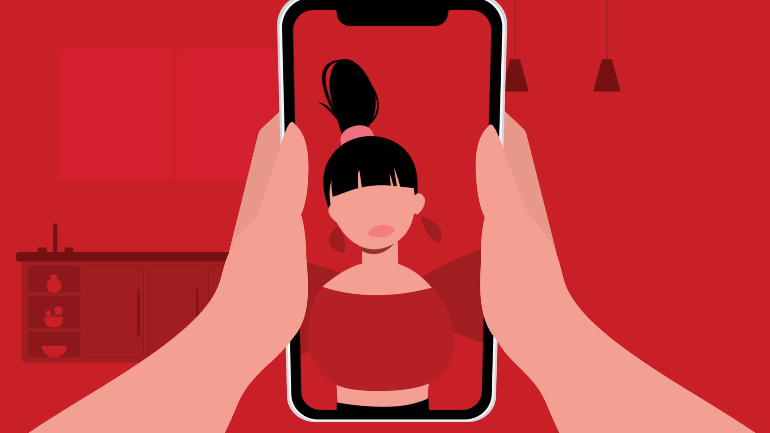
Illustration Style
Opportunities where we could tell more specific stories we relied on illustration and motion graphics to develop assets that were a little more custom.
Credits
Agency / CP+B
Client / American Heart Association
Illustrations / Flavor