Goose Island Beer Co. Identity

Goose Island Beer Company
Based in the city of Chicago, we saw a lot of potential for this beer company to tap into it’s roots in a truly authentic way. We wanted to do something that felt fresh and completely different from the rest of the craft beer category. Goose Island had all of the right ingredients (in beer and in spirit), we just needed to bring that out. This is a beer company that exists in street culture.
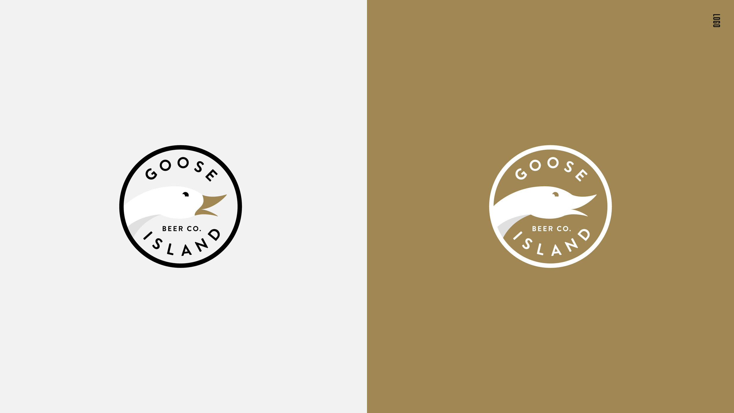
Logo Refresh
We had a vision of how we wanted the logo to work across all channels and all touch points. Our thought was to lean more into what was already working well with the current logo, and make minor refinements, and concise use cases. Our goal was to apply it as a design element in a way that it we would begin to build visual equity.
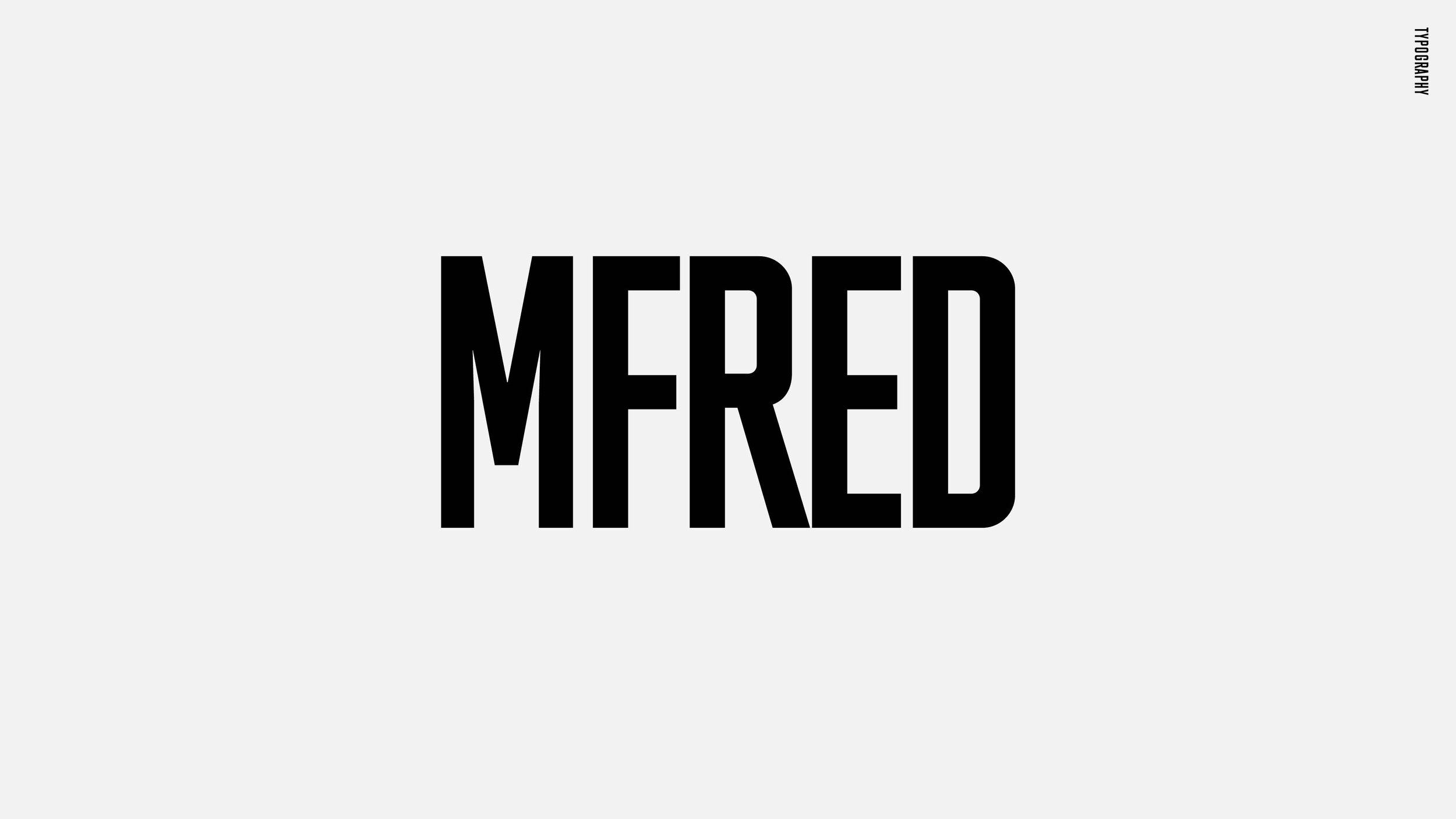
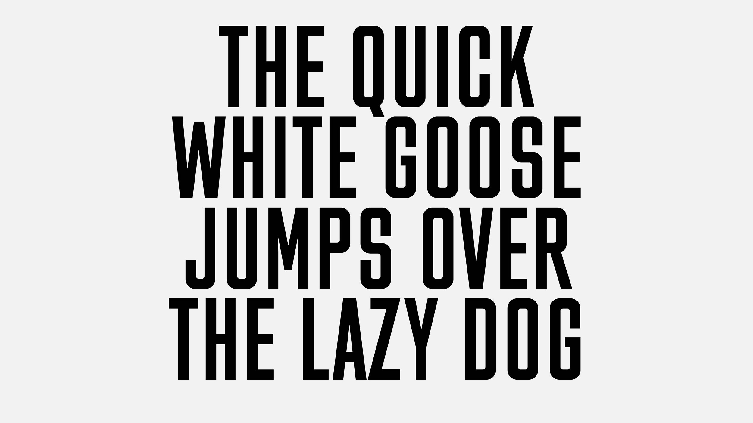
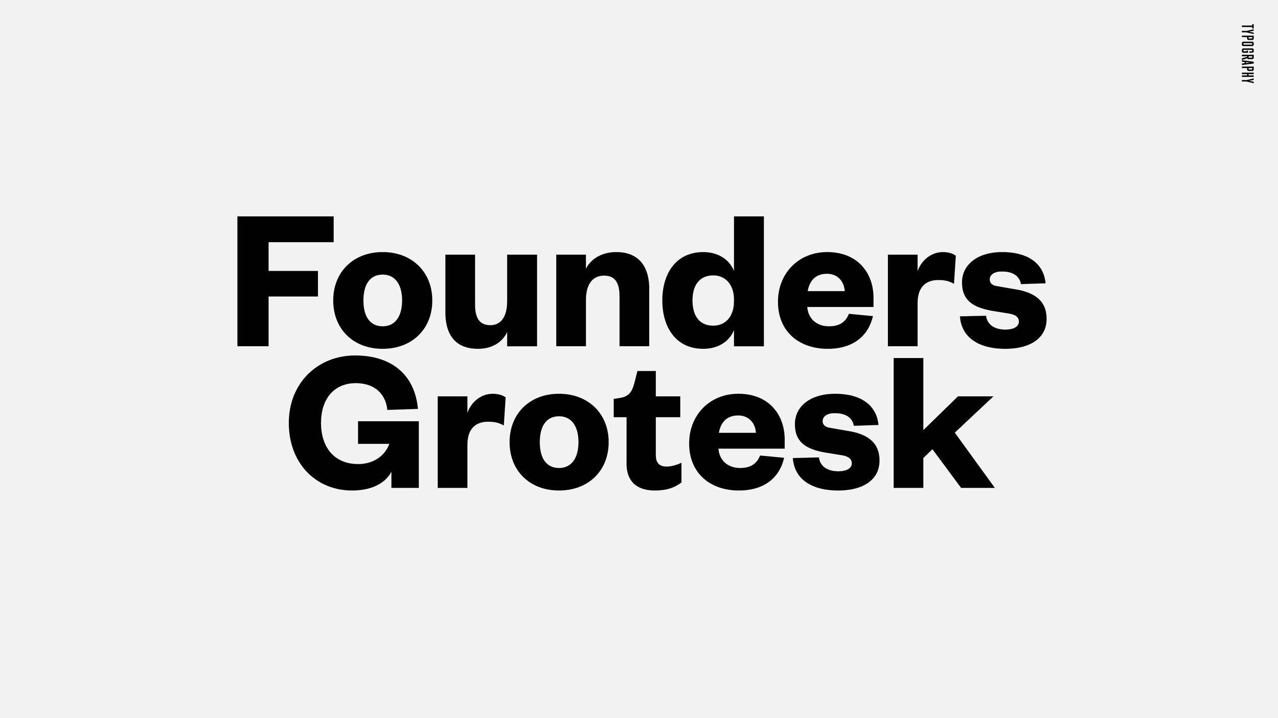
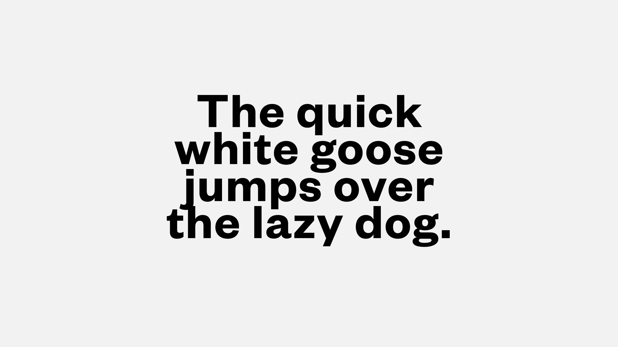
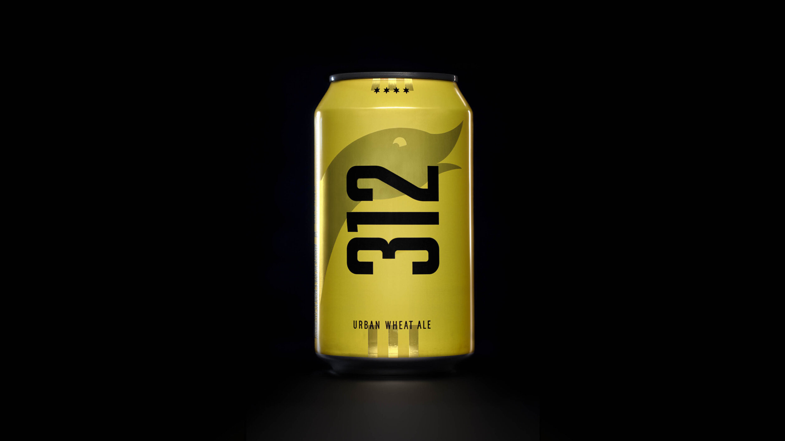
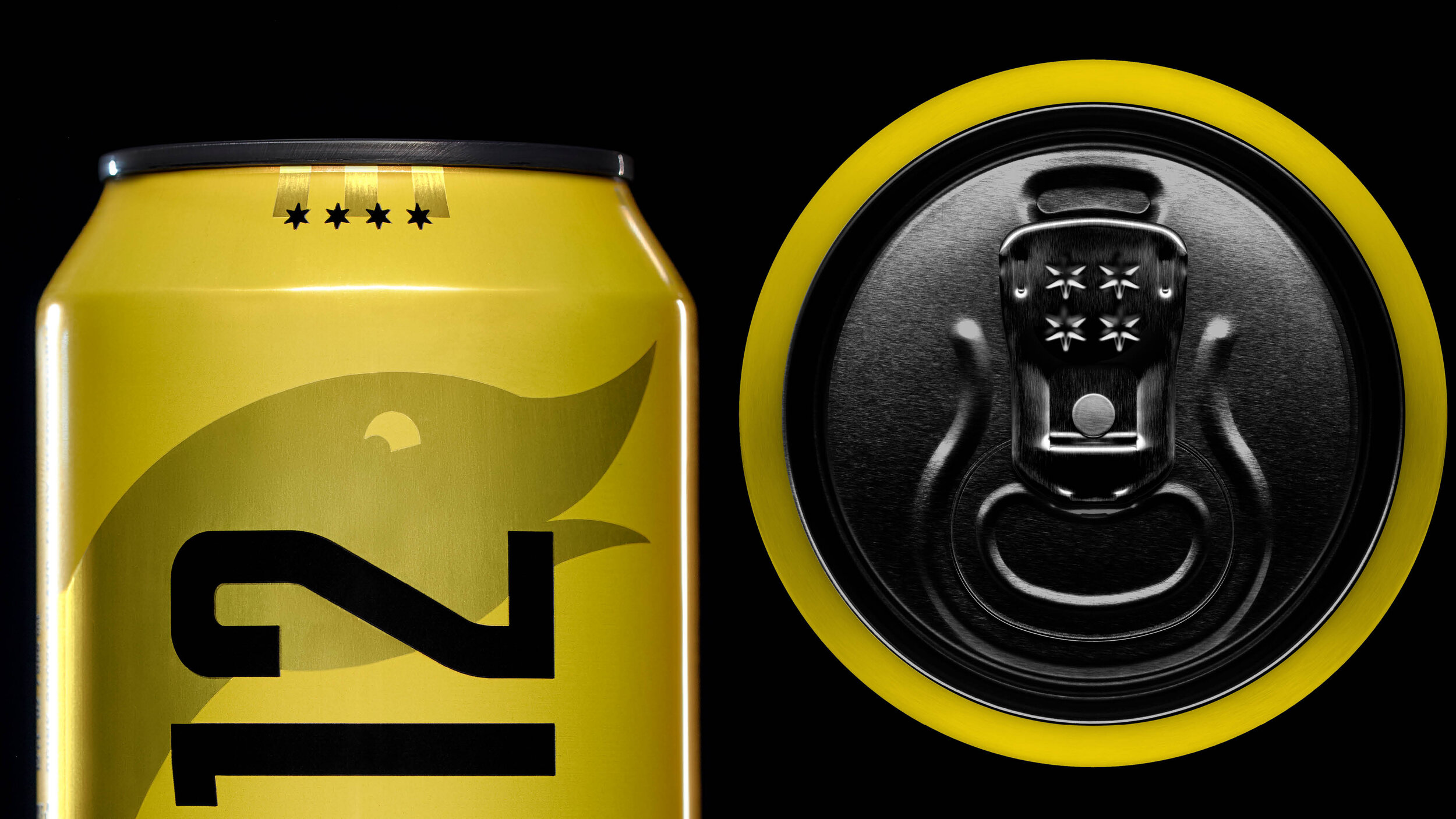
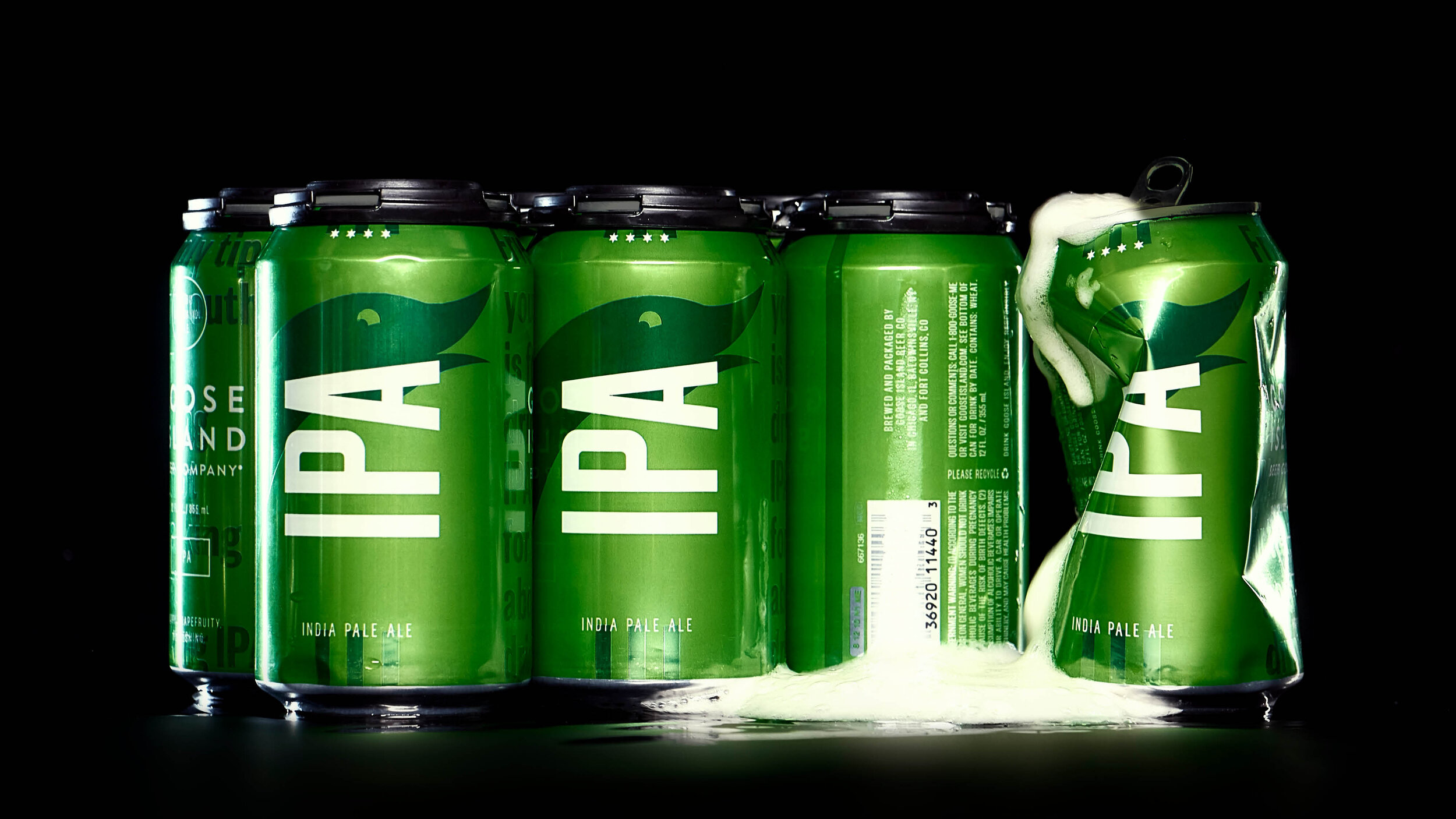
Typography
We wanted to utilize a font that could work as a display font, packaging, as well as advertising. It needed to feel bold, and also timeless.

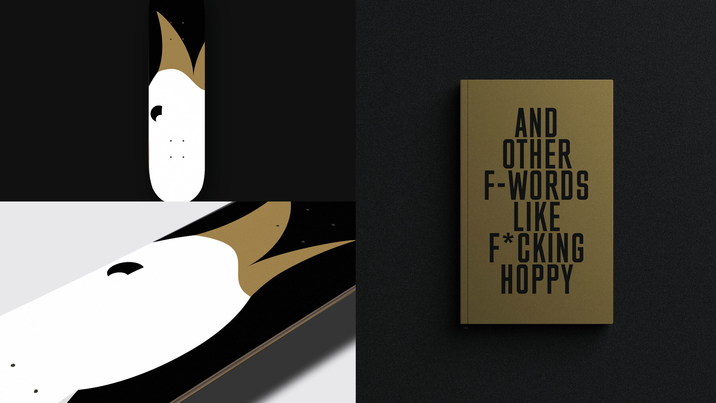
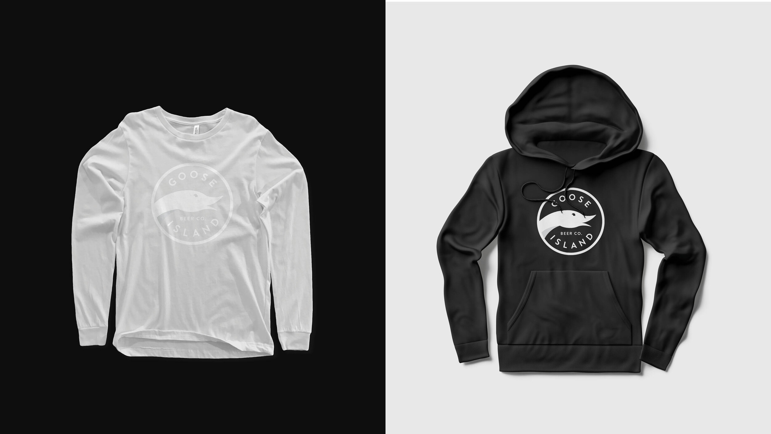
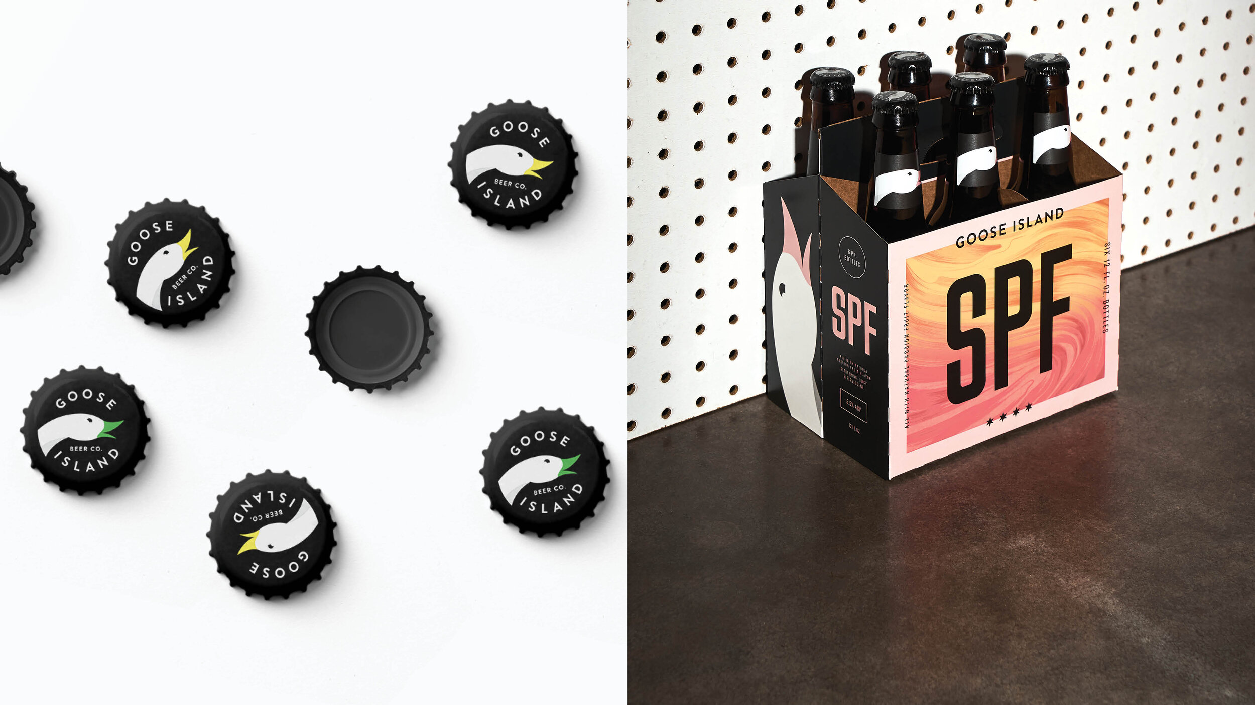
The World of Goose Island
What we loved about Goose Island, is that they were already really good at merch. We just needed to give them a design language that we could not only apply to what they were already doing, but inspired new ideas they hadn’t thought of yet.

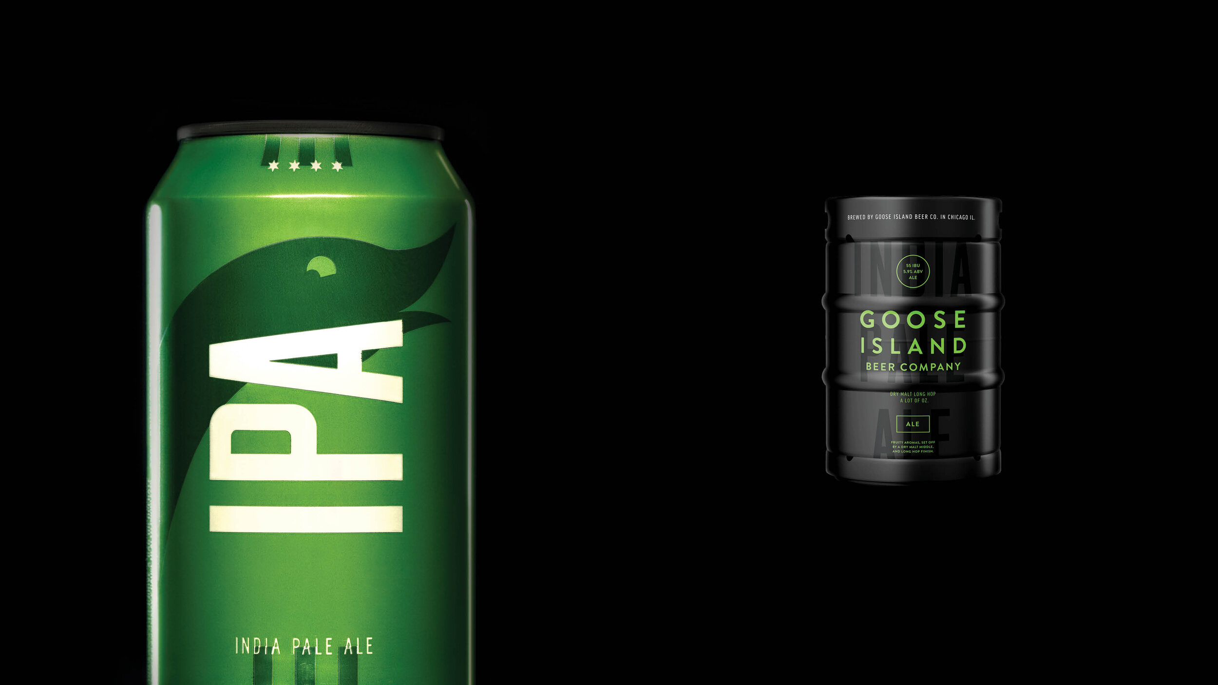
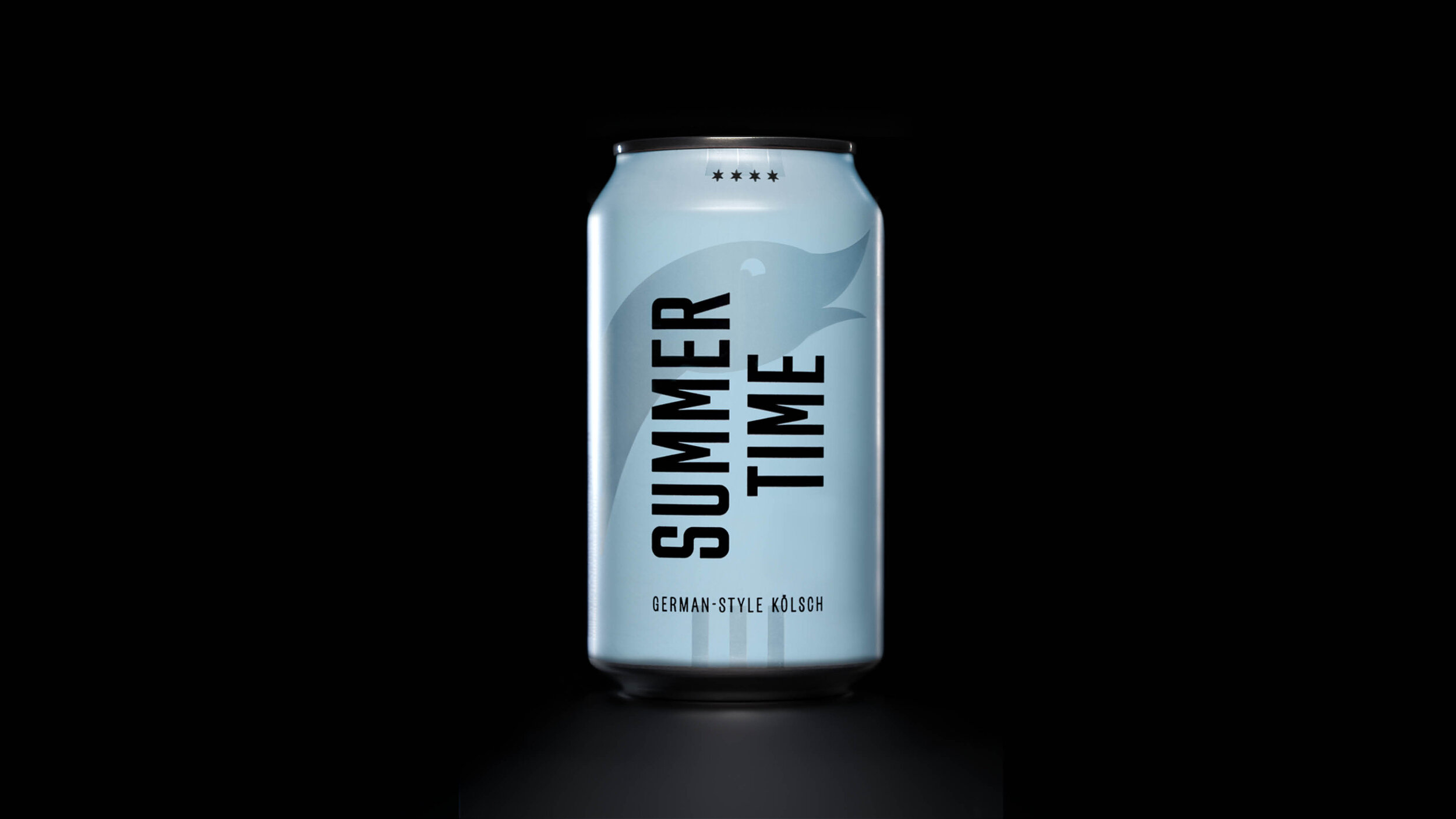
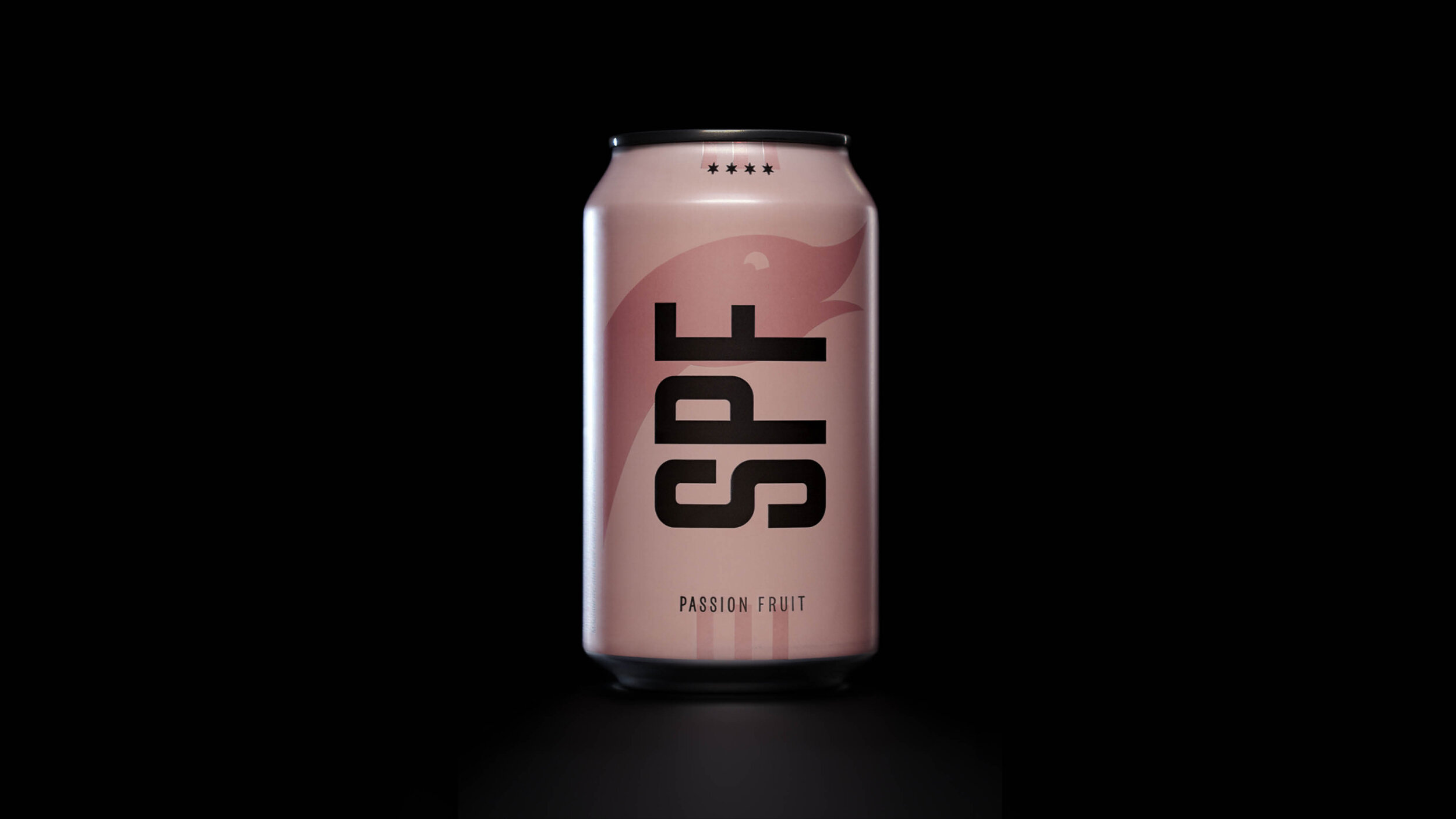
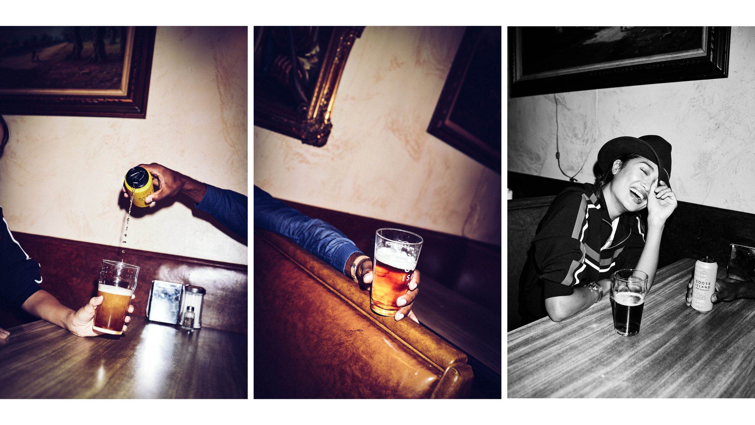
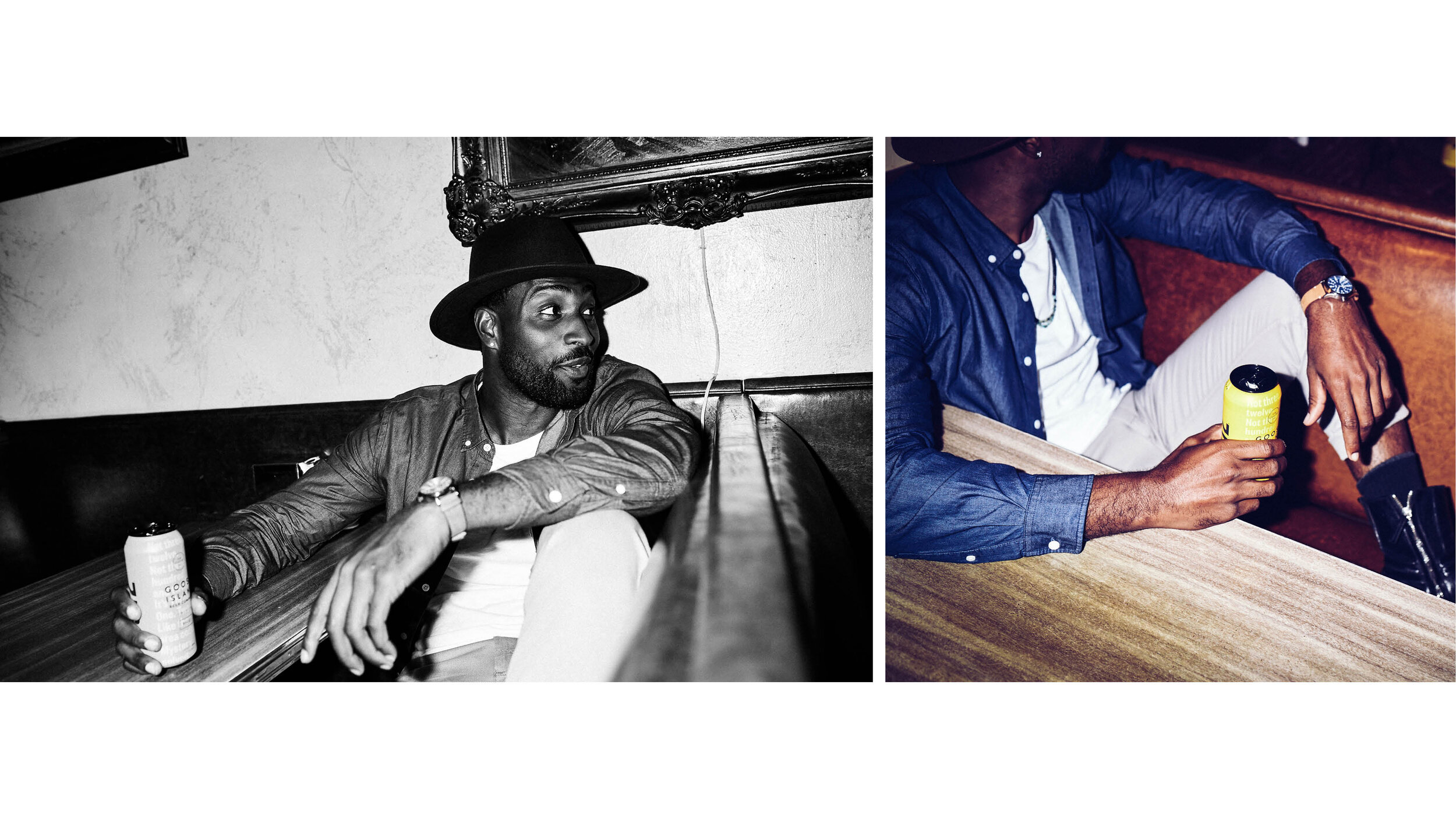
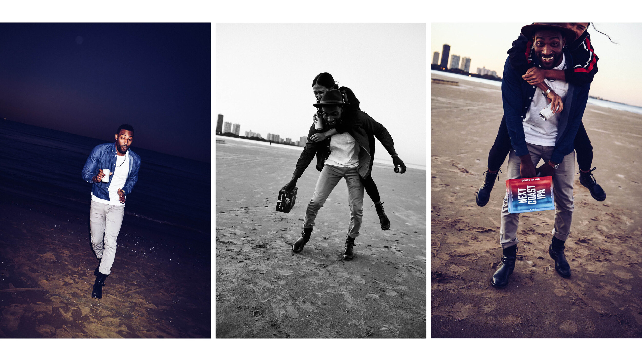
Package Design
It’s not often that you have the opportunity to affect packaging in a way that it is consistent with all of a brand’s touchpoints. This was a great opportunity to think about the packaging conceptually and how it fits into our world of Goose Island. How would it work in our ads? How would it function on social? How legible would it be in the hands of people at concerts? These were the types of questions we asked ourselves during development. Our goal was to develop a design that made the product feel more like an accessory to our target audience. It needed to feel fashionable. Sort of like a woman’s purse.
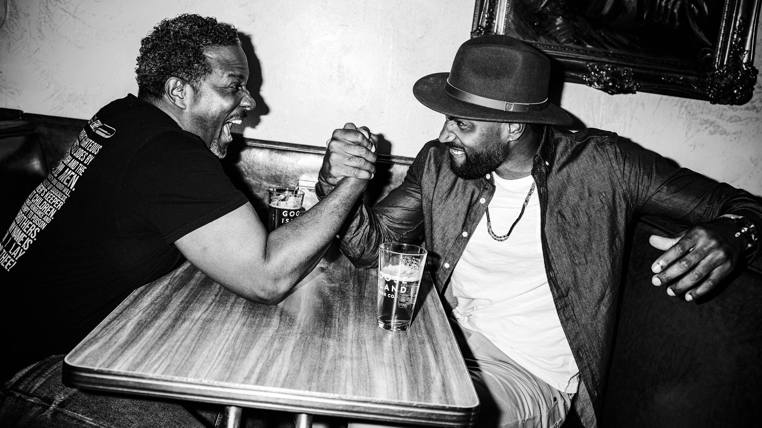
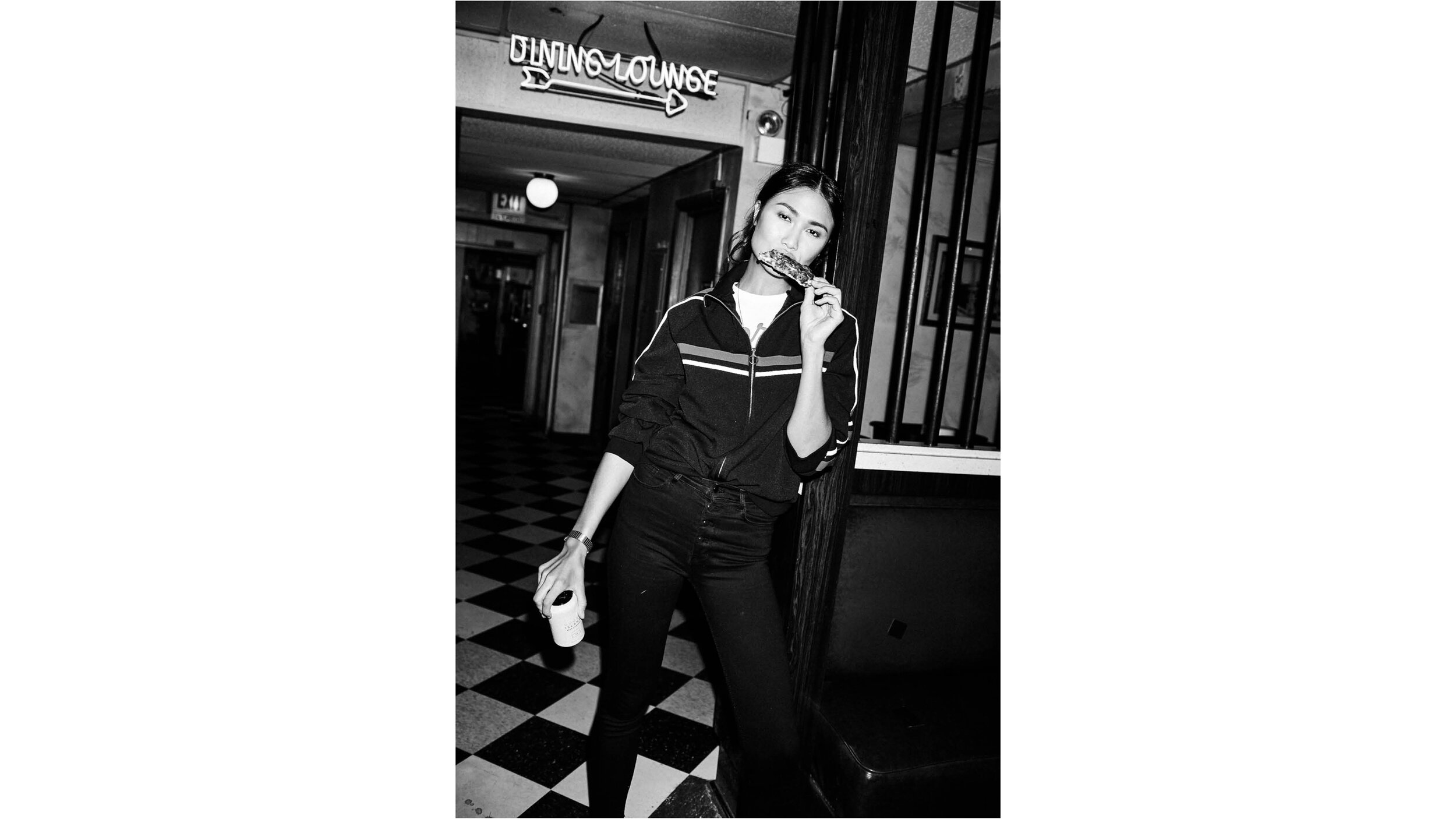
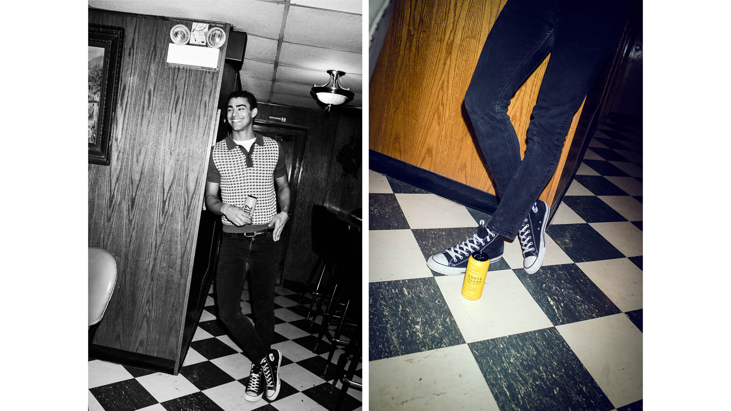
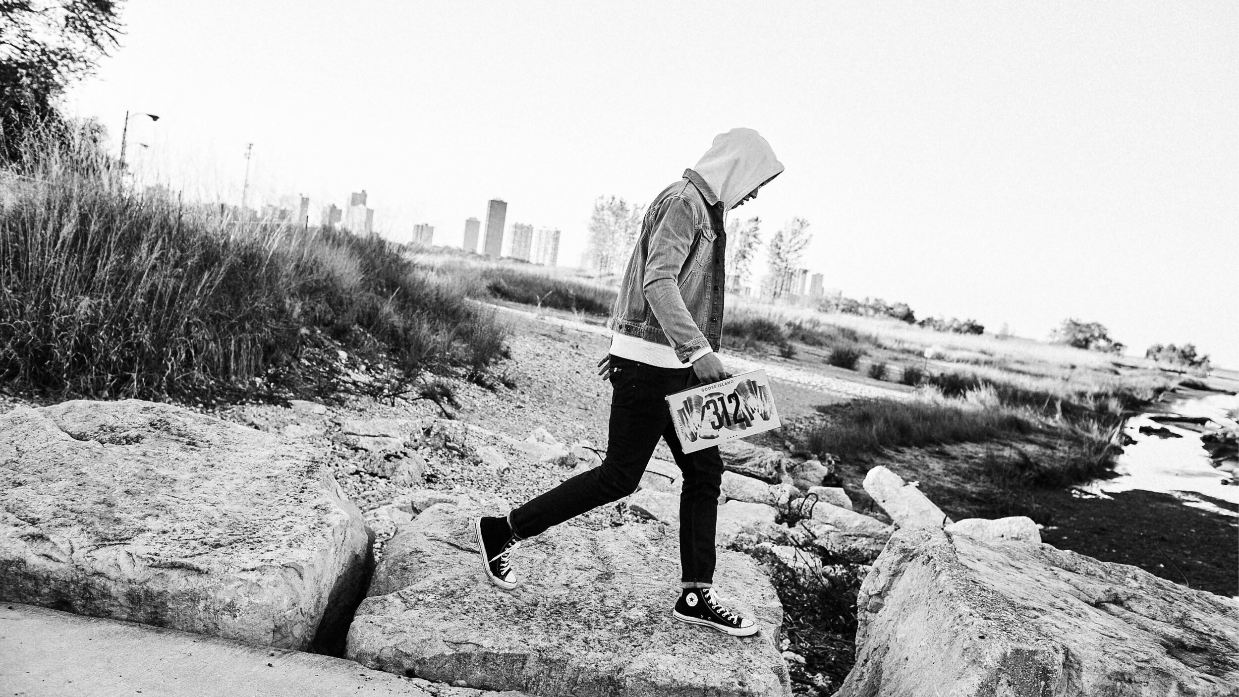
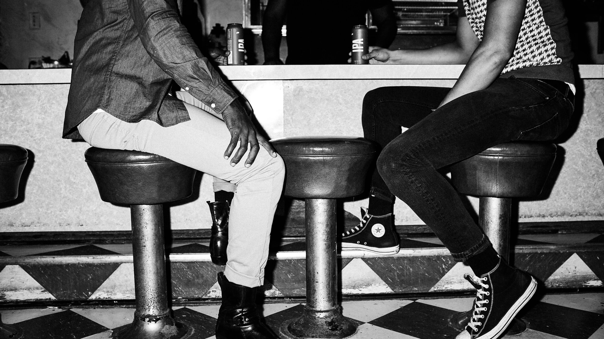
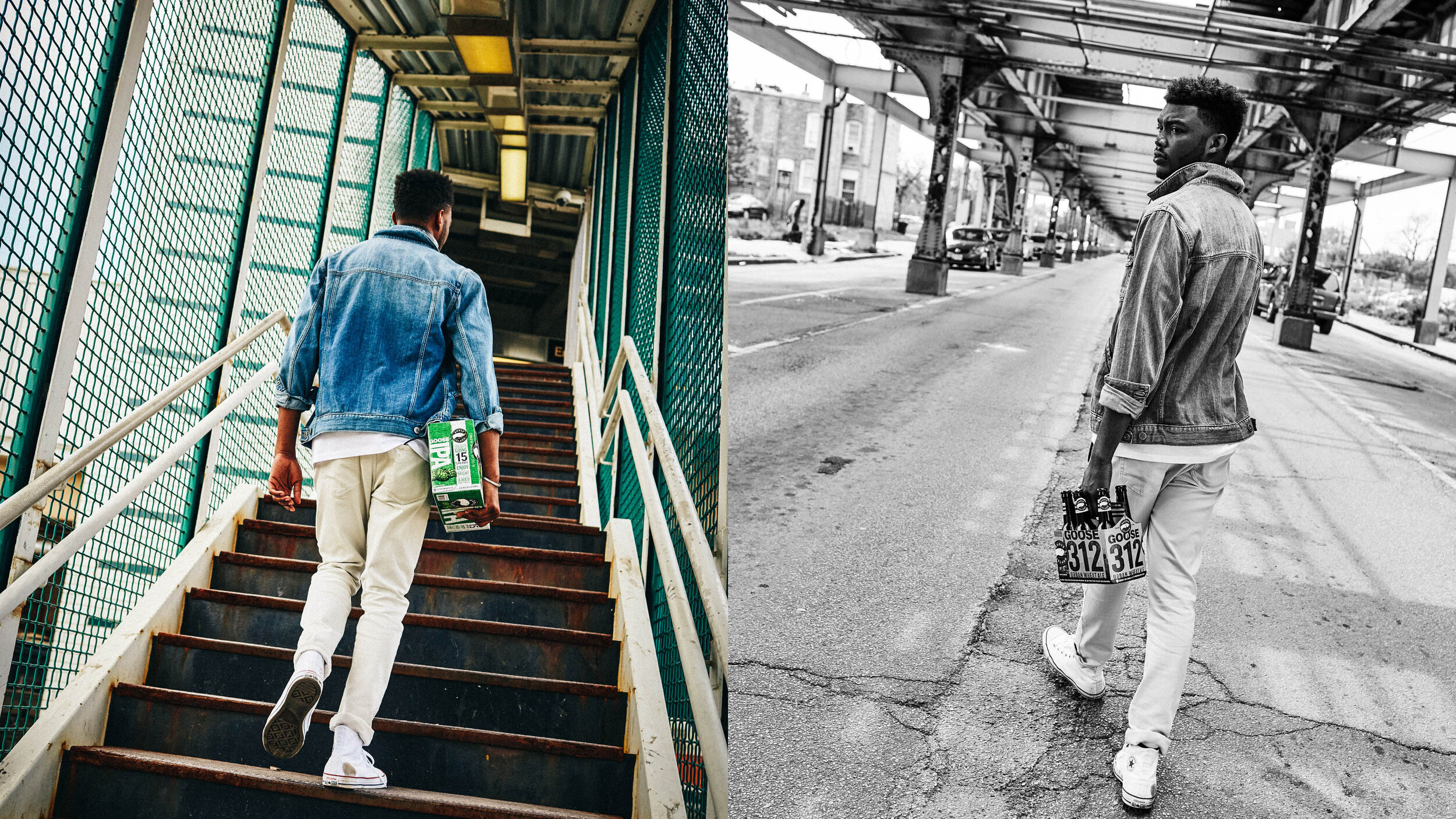
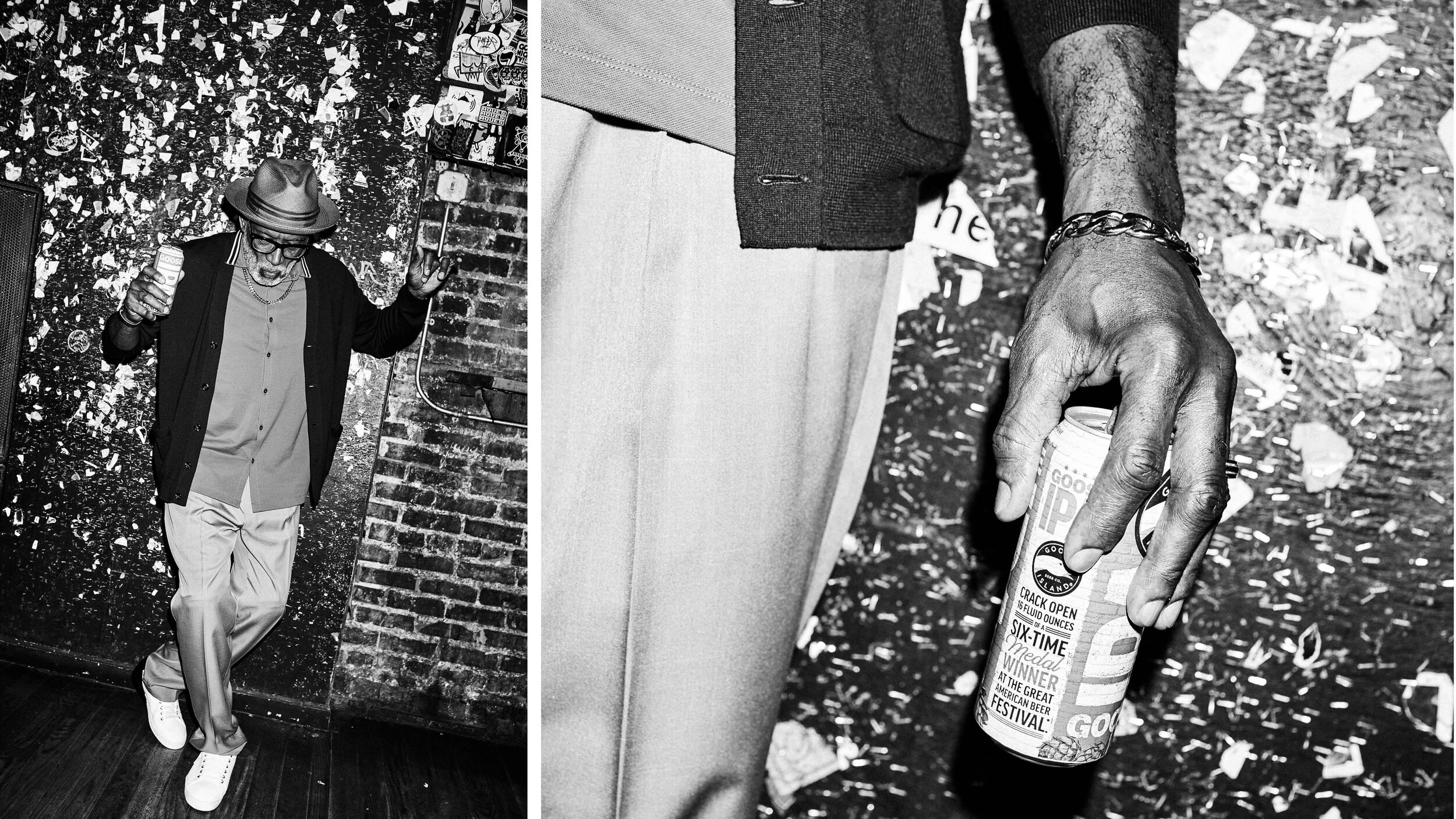
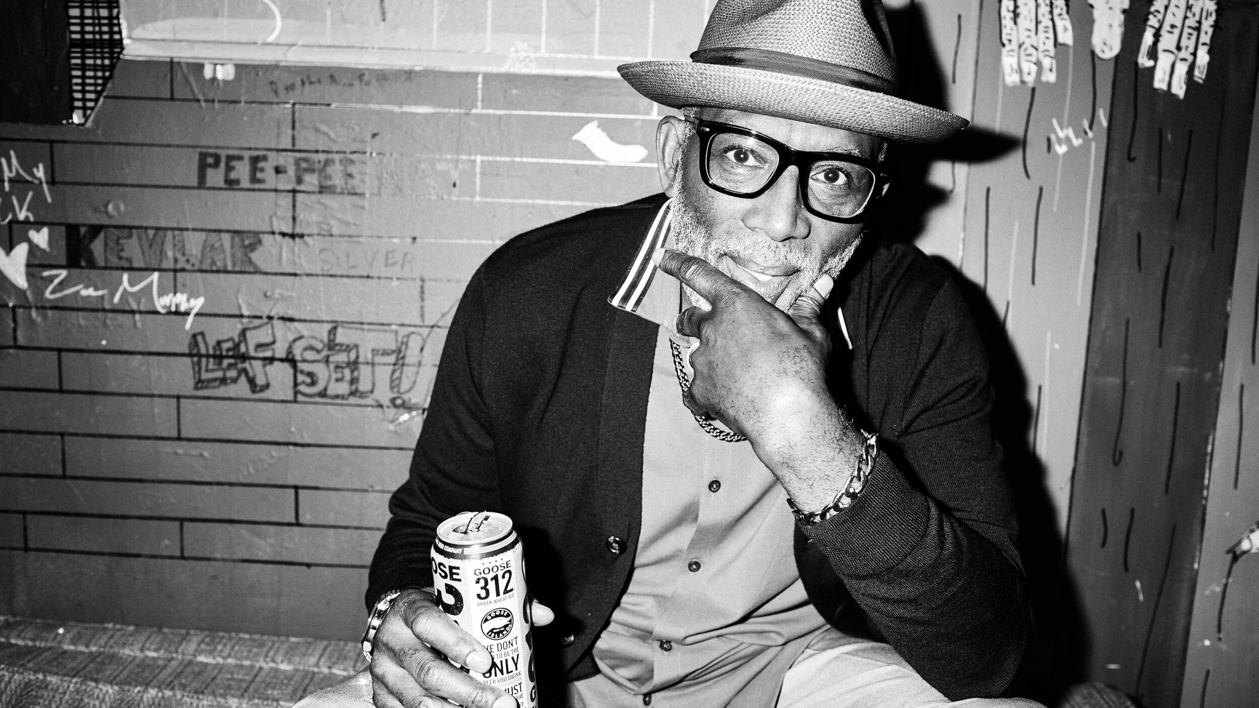
Photographic style
We wanted a photography style that would always feature and depict people in an authentic, in-the-moment way. These are people/subjects that, like goose island itself, write their own rules, don’t necessarily follow anyone else’s, and live life how they want. Considering Goose’s roots, everything should feel authentic to chicago—no bullshit; fun, confident and smart but not cocky or sophomoric, etc.—but also reflect a universal sentiment/vibe/tone, and be true to most anywhere else. In short, this look had to be the visual manifestation of our brand voice.

Credits
Agency / CP+B
Photographer / Brian Sorg
Client / Goose Island Beer Co.